
Living near the sea in Southend, Essex, Sarah Clements and husband Andy had already renovated their previous property – a 1930s three-bed semi – and weren’t looking to move.
But when they noticed their dream house up for sale nearby, they decided to investigate, and the viewing changed their minds.
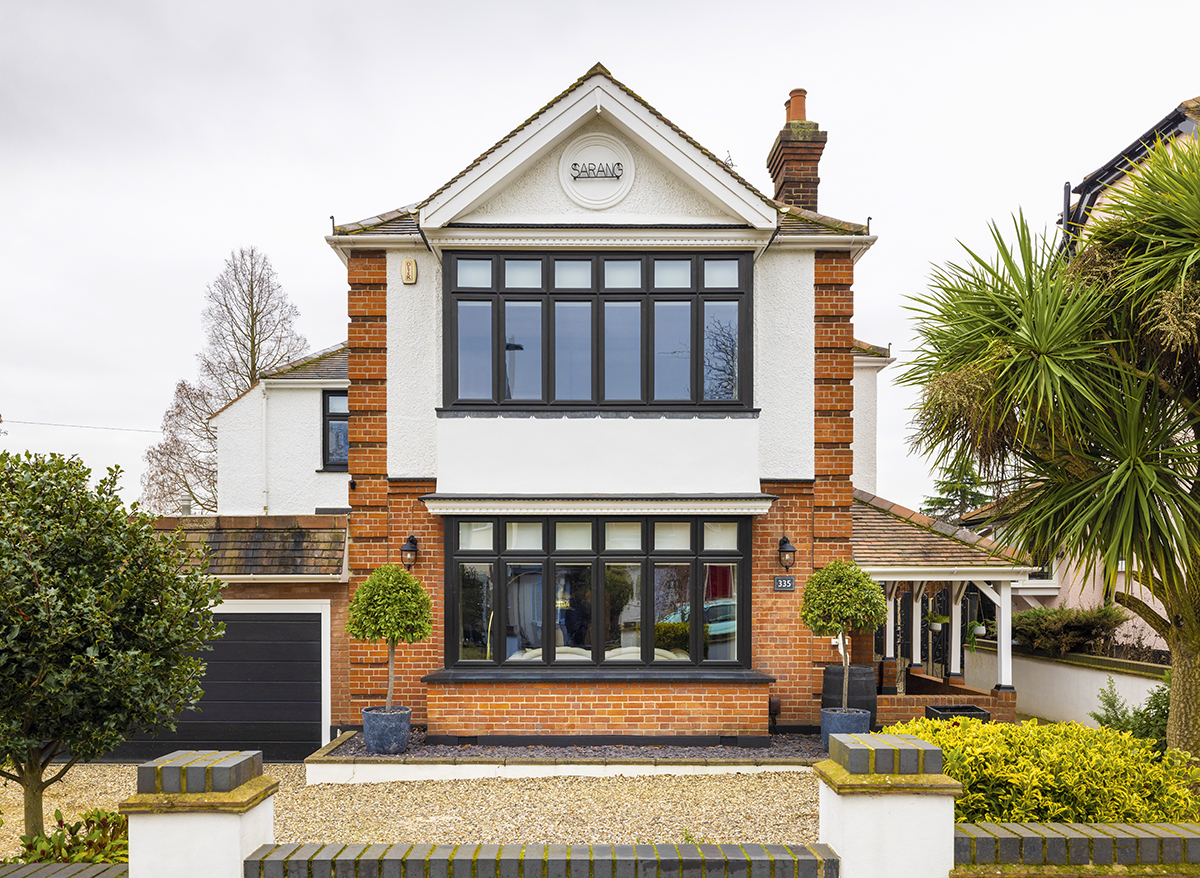
‘It was detached, had an extra bedroom, and a garden three times the size,’ explains Sarah. ‘I’m from Wales, so the idea of a guest room for when relatives come to stay really appealed. It’s something we didn’t have when the older boys were living at home.’
The couple were also impressed by the entrance to the property: the porch, and the stunning hallway and stairs. ‘There was so much space and light everywhere,’ says Sarah.
- ‘We’ll turn our hand to anything involving DIY’ – how one couple updated a cottage with a fascinating history
- Renovating a Grade II-listed building – how these owners turned an old forge into an INCREDIBLE forever home
The couple could immediately see the potential to improve things even more. ‘The kitchen was small for the size of the house, and not very sociable, and there was a large old conservatory across the back, plus an outside toilet,’ continues Sarah.
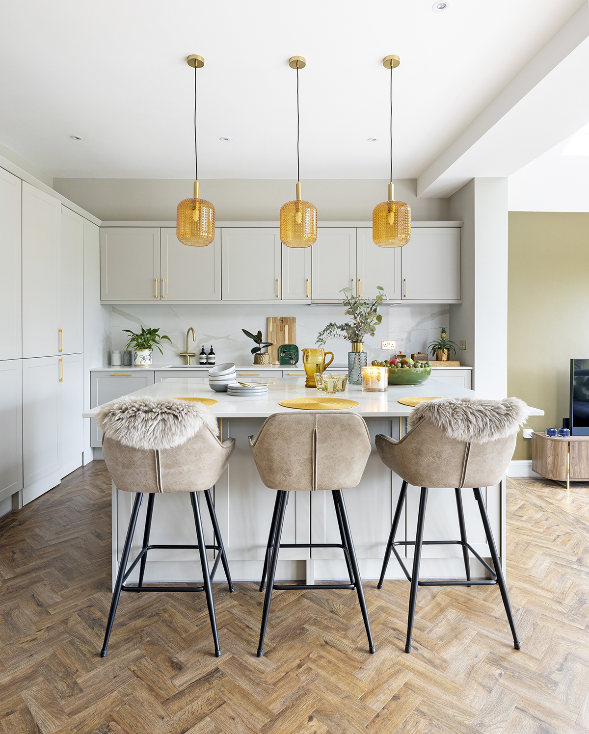
‘It was ripe for tearing down and starting again, but it was a big project. We knew we’d have to wait and do it properly, carefully considering what we needed and working to a budget.’ Being big DIYers, Sarah and Andy started by painting the dark wood kitchen units in a stone colour to lighten things up temporarily.
Welcome to our home
A bit about us
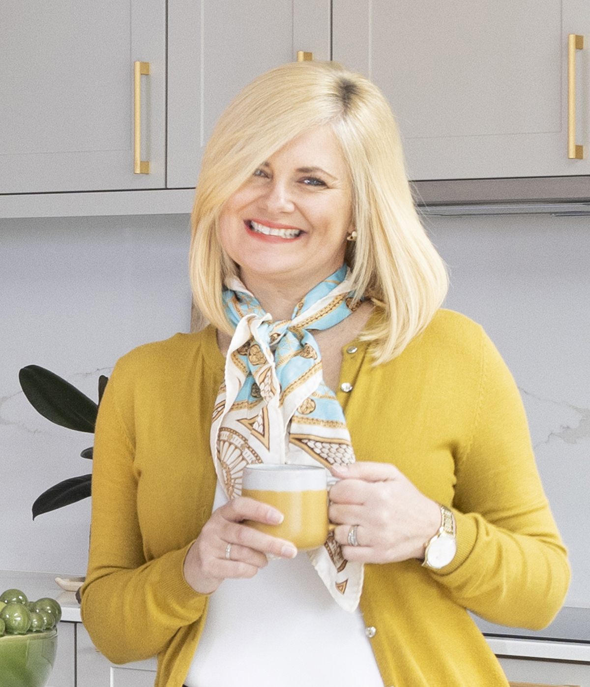
I’m Sarah Clements, 48, a head teacher, and I live with my husband, Andy, 55, the managing director of a mobile swimming pool company, our son, Freddie, 14, and dogs Lulu and Mabel, with regular visits from grown-up sons George, 28, and Ross, 25. I document my style on Instagram @1930sarang.
Where we live
Our home is a four-bed 1930s detached house in Southend-on-Sea. We moved here in March 2019.
What is my best bargain
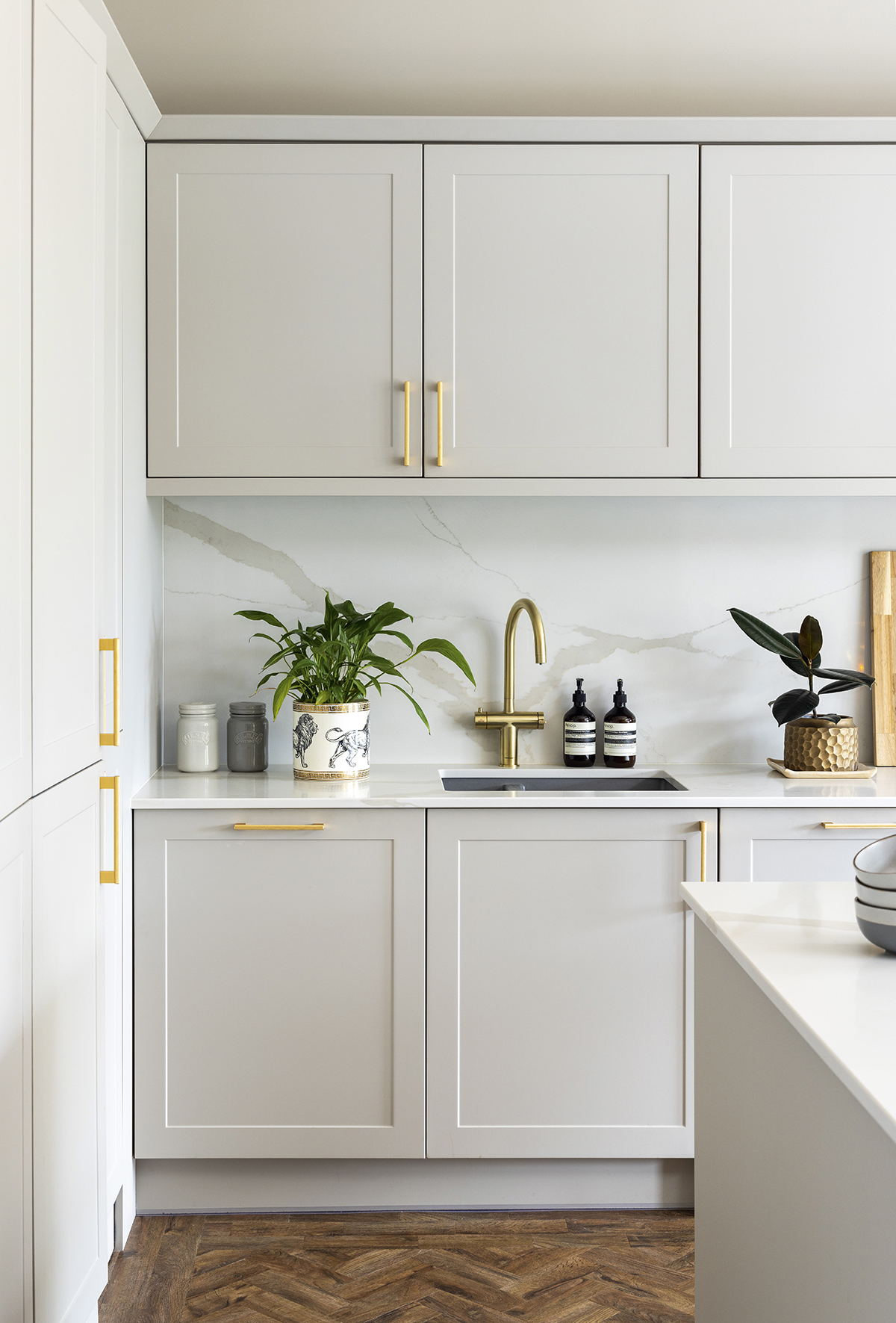
The kitchen, sourced from a builders’ merchant. I’d never have thought to look there, but the range was fantastic and it looks far more expensive than it actually was.
Creative colour
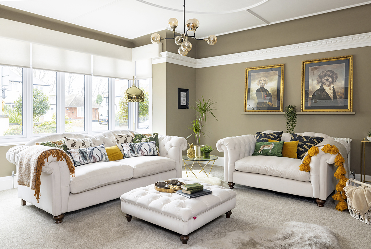
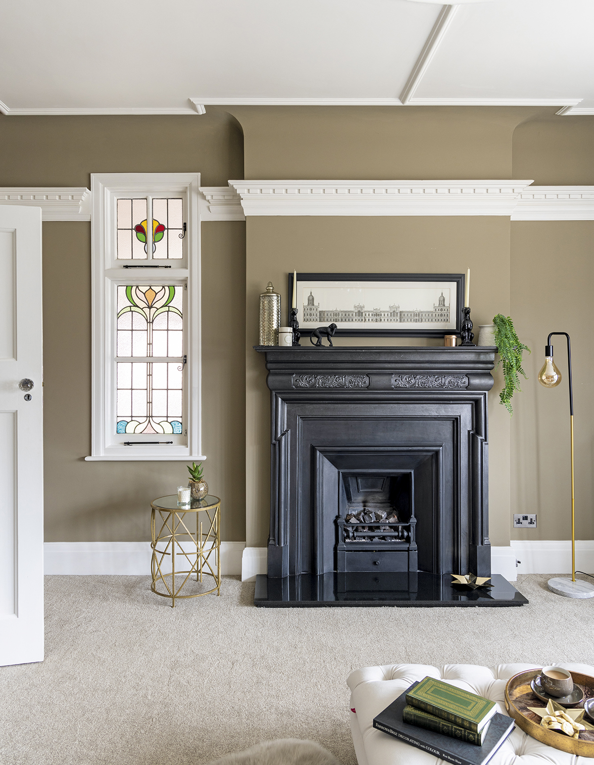
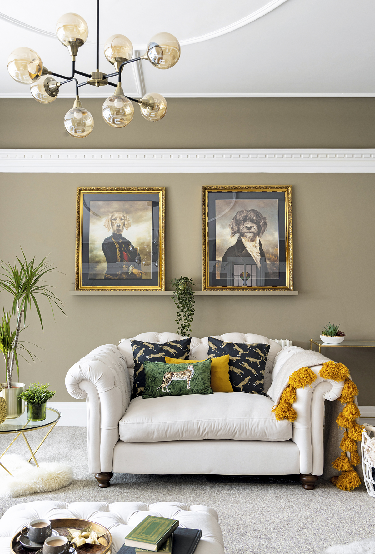
Decorating the house and bringing in the earthy greens, rusts and stone shades she favours was high on Sarah’s wishlist. ‘I was conscious to fit in with the age and style of the house, and we love a mix of old and new, so I’ve added some vintage pieces too,’ she says.
One of the first rooms to tackle was the large lounge, and Sarah settled on Mouse’s Back by Farrow & Ball for the walls. ‘I didn’t want anything bright, but neither did I want wishy-washy,’ she says. ‘I can be a bit of a one for repainting and changing colours, but this one has stayed – and it’s still a favourite.’
In lockdown, Andy decided to add panelling in the main bedroom, teaching himself how to do it, even adding a ledge to display little items. Going across the full width of the back wall behind the bed added character to the room.
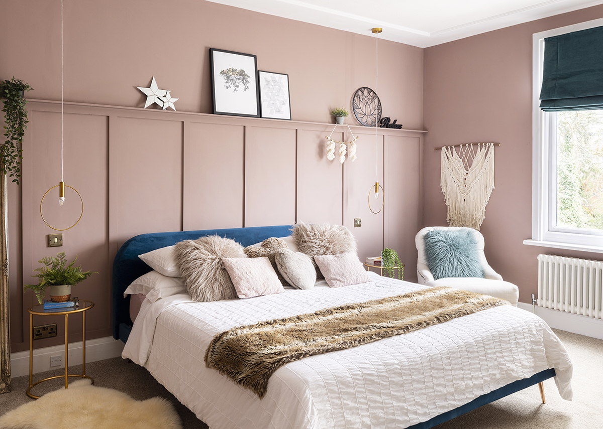
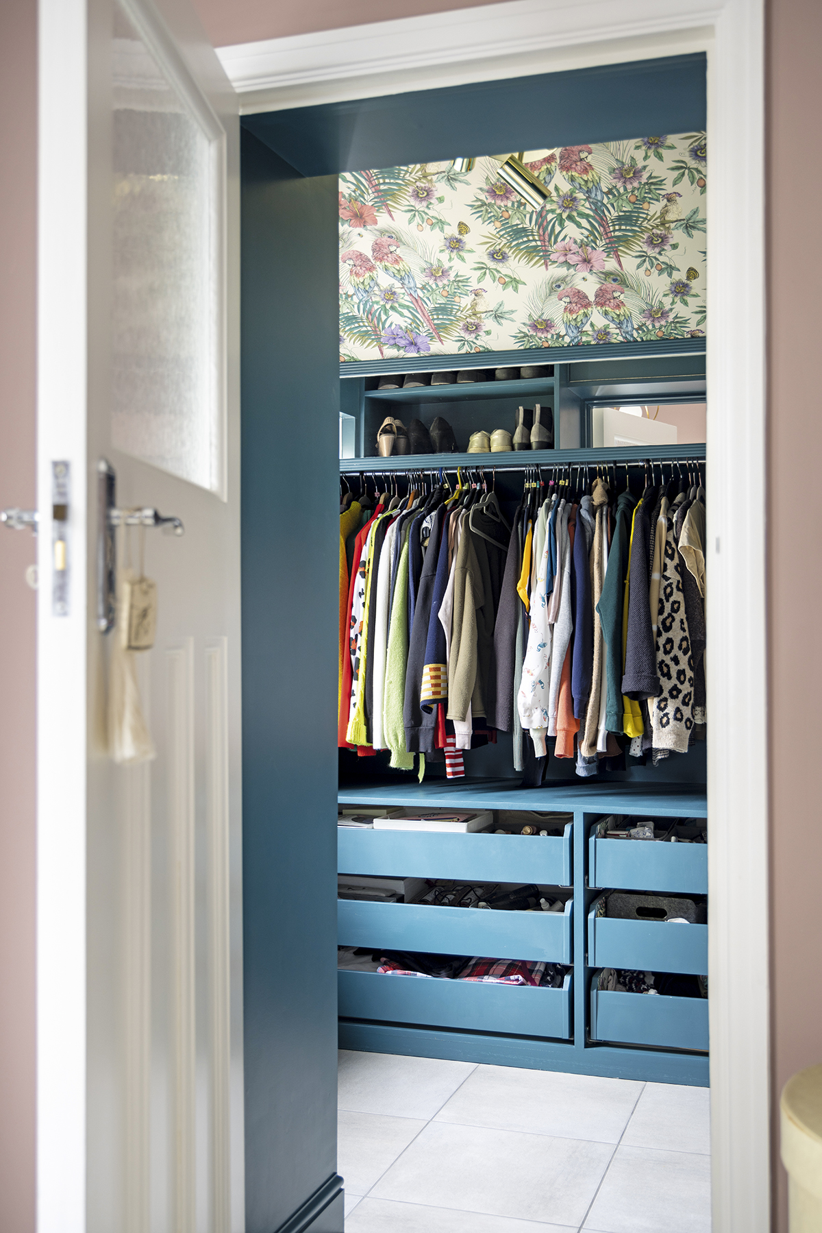
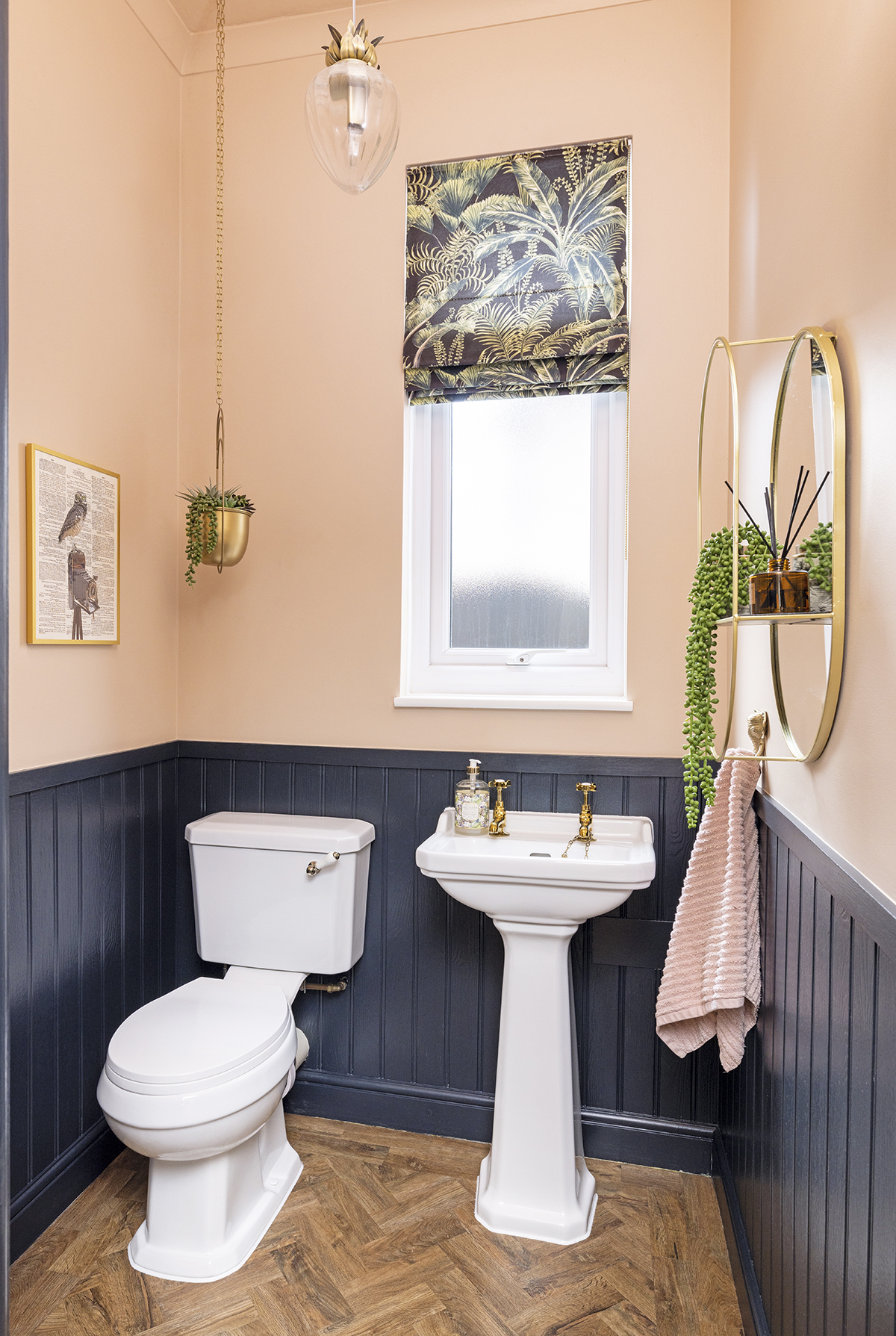
‘There was already some panelling in the little cloakroom downstairs, and it goes with the age of the house. It looks very elegant, and Andy did a fantastic job,’ smiles Sarah. When it came to colour, Sarah chose Farrow & Ball’s Sulking Room Pink. ‘It’s quite subtle, and not too in your face, and we added blue to the dressing area of the bedroom as a contrast,’ she says.
Room to grow
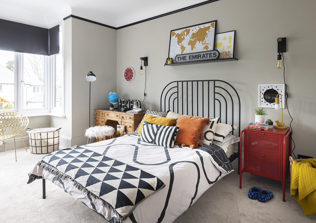
With their bedroom sorted, Sarah turned her attention to son Freddie’s and thought long and hard about designing the large room. ‘Finding the right balance in kids’ rooms can be tricky,’ she reflects. ‘It needs to be a space they love, which works for the whole family and can change with them.’
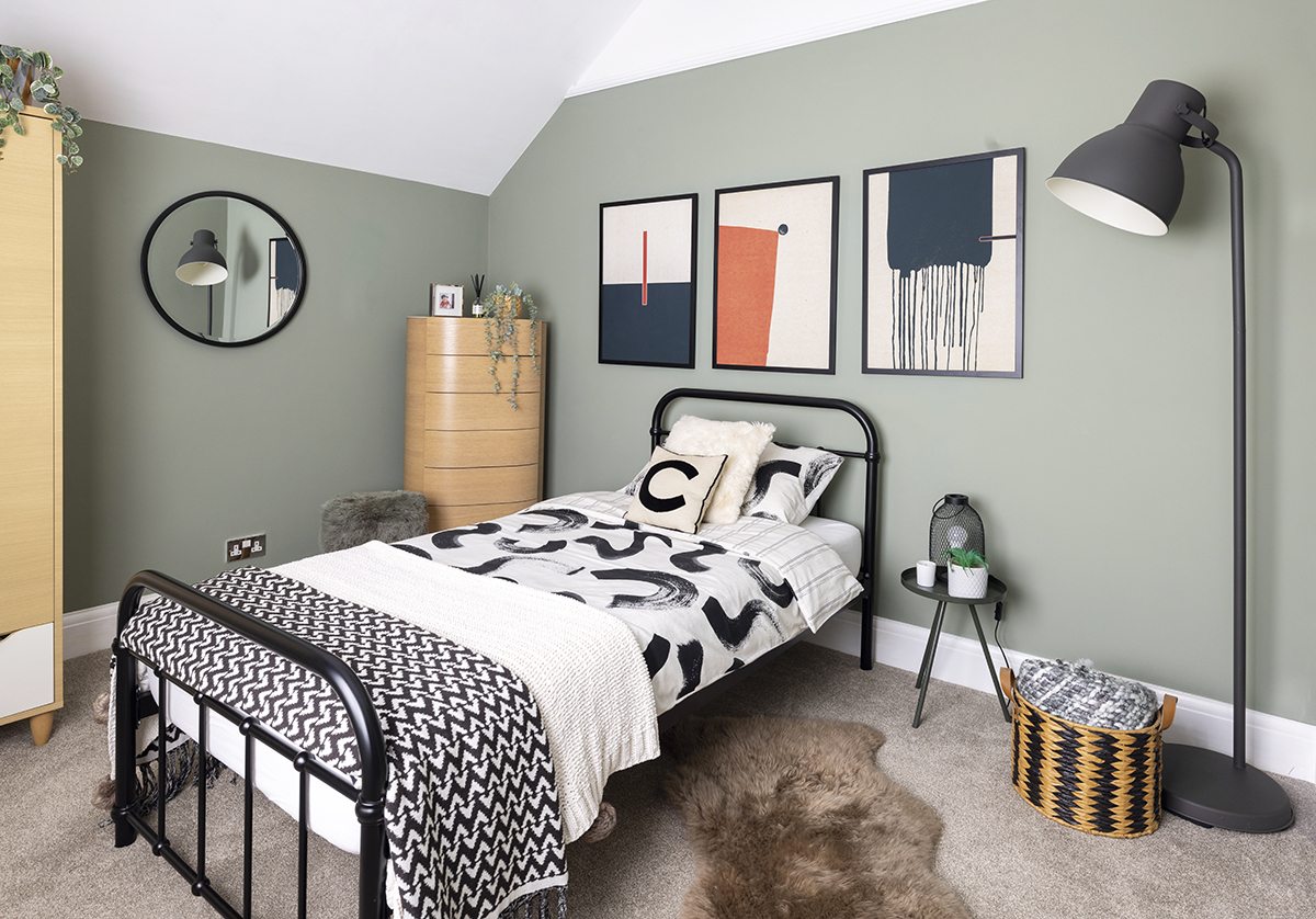
Sarah opted for a sleek monochrome palette for a more mature vibe but, to keep it youthful and playful, added pops of primary colours with soft furnishings and accessories. ‘I hope I’ve managed to achieve that balance,’ she says. ‘I liked it so much I went for a similar monochrome scheme in both of the guest bedrooms.’
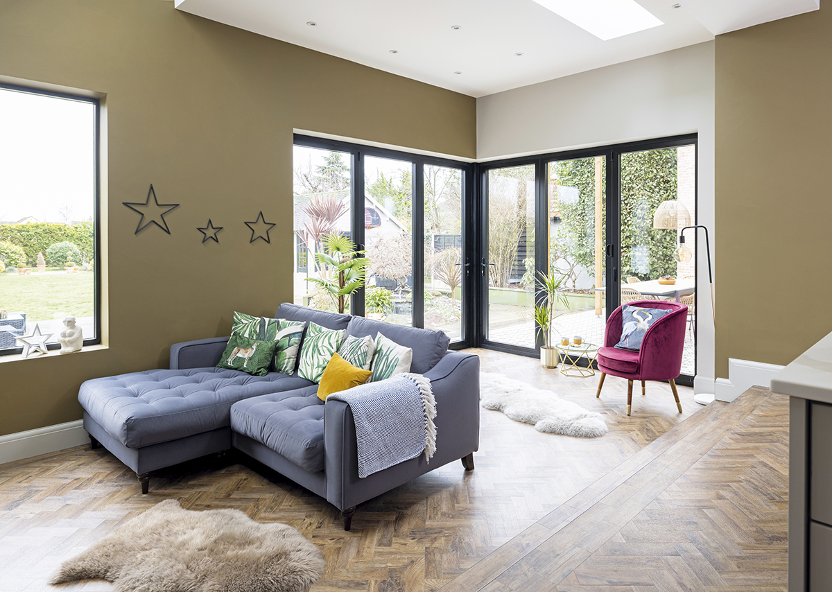
When the long wait to change the back of the house was finally over, Sarah was more than ready. ‘We couldn’t wait to get our hands on it!’ she laughs. ‘We love to entertain, and it was obvious that we should demolish the conservatory, put in a new kitchen and create a big open-plan space. I didn’t want a box plonked on the end of the house with a lantern, so it needed time and thought.’
Time to transform
After consulting architects and taking on a local building firm, the couple decided on a split-level plan, with the kitchen on the same level as the rest of the ground floor, and steps down to the new open-plan area, with a large, covered terrace outside to step directly out onto.
‘We’ve gone for height and light, with Velux windows in the roof, and a multifunctional feel with zoning,’ Sarah explains.
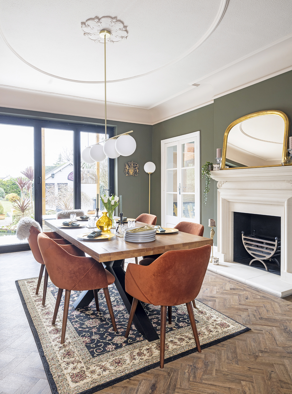
Getting the flooring right was an important part of the scheme. ‘There was a large area to think about – the kitchen, the new extension, the hallway and the dining room – so I wanted something that would look right in all those spaces and be hard-wearing,’ says Sarah, who ultimately chose a parquet-style luxury vinyl.
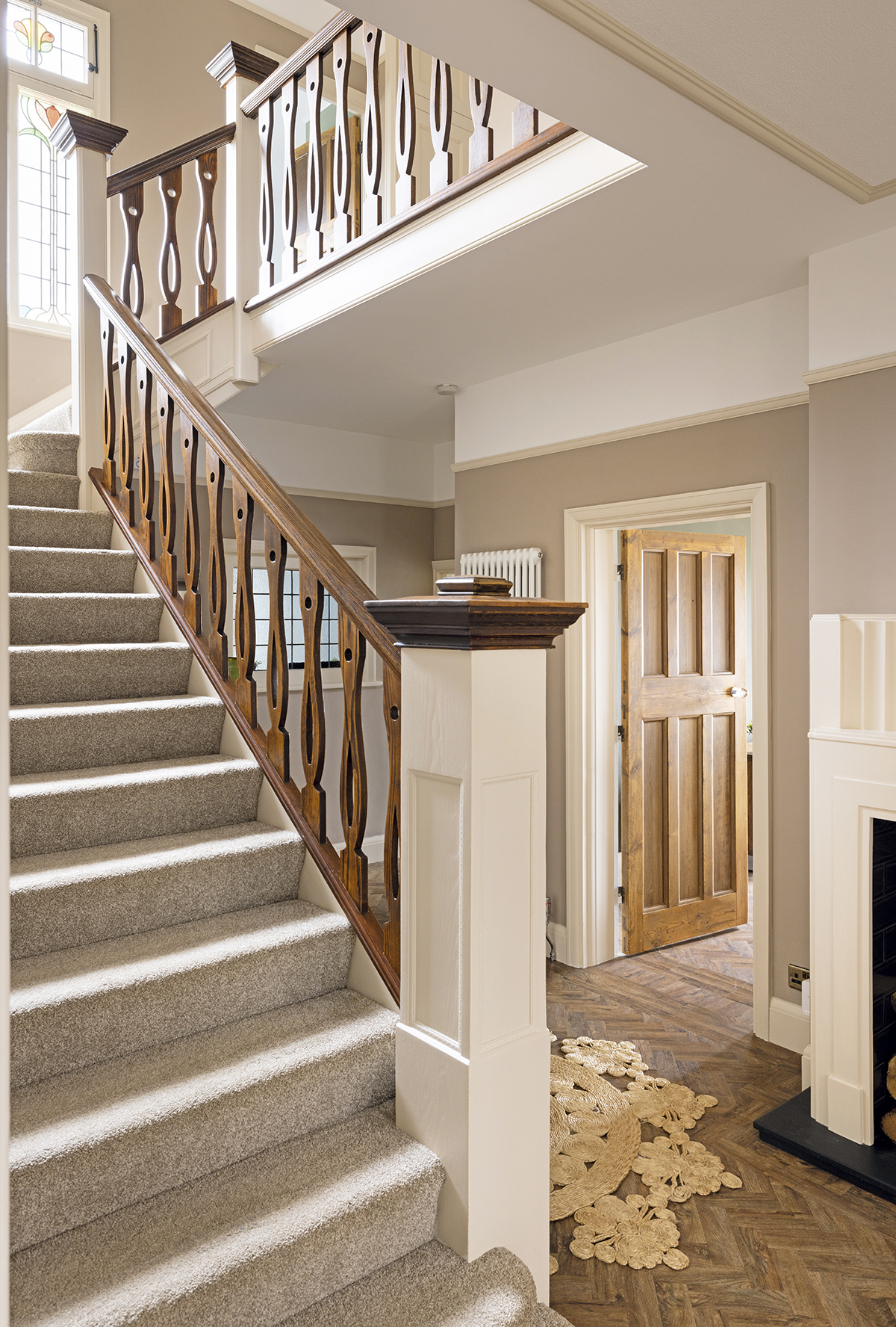
‘Real wood would have been incredibly expensive, and this looks lovely and it’s half the price,’ she continues. ‘With the extension opening straight out into the garden, and the dogs coming in and out, it’s also a much more practical option because it can easily be wiped clean in moments.’
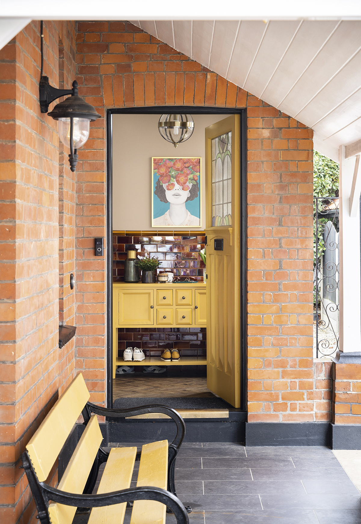
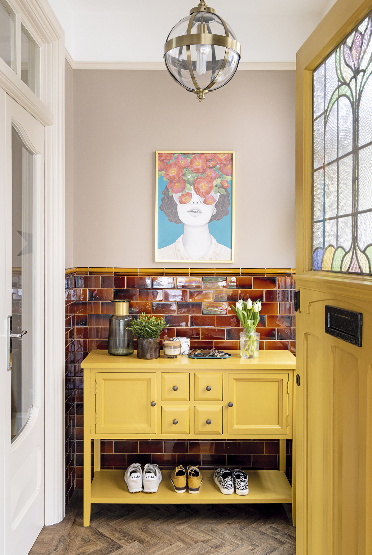
With the flooring finished, and all the rooms decorated, Sarah concentrated on pulling together pieces of artwork and items of furniture to complete her look. ‘We adore this house now,’ she says. ‘The new extension was the key to unlocking its potential.’
This is a digital version of a feature that originally appeared in Your Home magazine. For more inspirational home ideas, why not subscribe today?
Feature Stephanie Smith Photos David Giles
Read more:
- This Last One Laughing contestant's home is a celebration of vibrant shades: ‘It needed colour and soul – mission complete!’
- At home with Katie Price's sister: ‘A white witch told me this house had good spirits living in it’
- From dated and poky to dazzling and open-plan – you’d never believe this was the same kitchen
